Some issues with how to join the Fediverse I've observed

I’ve joined the Fediverse around four years ago, when I’ve put online the first version of this blog. It was based on Plume, a blogging tool that supported ActivityPub for users interactions and blogs federations until I’ve changed for Hugo (fr). Then, I’ve joined Fosstodon in September 2020.
After these years using the tool, interacting with people, seeing its usage peaks growing following the Twitter drama, I’ve noticed some issues with the Fediverse. There’s actually, in my humble opinion, a big problem with it : it’s accessibility. Not in the meaning of addressing disabilities, but how to join it for somebody who is not into the decentralized thing and always knew social medias such as Facebook or Twitter. And why it’s something that is possibly a blocker.
Now I have the attention of the knives you’re about to throwing at me, let’s explain why I consider there is some issues with the Fediverse joining process.
Reminder about the Fediverse
First, what is the Fediverse ? I’ve wrote about it years ago, in French, so I won’t go into the details and I’ll keep it brief.
The Fediverse, a portemanteau word Federation and Universe, is the name given to what is actually on a user’s perspective … A big mess.
The concept is quite simple : it’s a set of various online communities management tools that can discuss and exchange together thanks to a common communication protocol, ActivityPub. Basically, it’s like sending e-mails to each other : we don’t need to have an account on Gmail, Outlook, Yahoo, etc, for this. The Fediverse is the same thing.
However, there are various tools, communities, topics, languages, not everyone being connected to each other, etc, that can be difficult to apprehend for somebody who is not into it.
One of the most well-known Fediverse tool is Mastodon, resembling to Twitter, or X, or whatever its weird owner would call it after changing again his mind, and being quite loud on the Fediverse stage. But there are also other tools that answers other uses cases, such as Pixelfed for photo sharing similar to Instagram and PeerTube for online video streaming like YouTube. These three tools (and there are others again) allow somebody with an account on it to interact with people with an account on another of these tools’ instances.
Instances, that’s the big word for the Fediverse. Unlike Twitter, Facebook, Instagram, TikTok, whatever else, the Fediverse is composed of communities, or instances, or servers, using a tool.
If you’re an old jerk like me, you may have known the Internat Relay Chat (IRC) or online forums such as phpBB ou InvisionBoard powered. If you’re older, you may also recall the Usenet newsgroups. These things still exist today BTW. These various tools and the communities around it were not connected. You were active on one or more forums, with as much accounts as there are forums. Same for IRC.
The Fediverse is the same vision, but connecting these communities if they want to. So if you were a user of Forum A, you could interact with people on Forum B without recreating an account on Forum B.
But today, we’ve been more used to centralized unique platforms such as the big social medias. You’re on Facebook ? You may interact with everyone on it because everyone is on it. Same for the others. That’s simple for everyone, assuredly, instead of having several places to be at the same time.
But, you can’t interact from Facebook to a Twitter person.
The Fediverse can, and that’s the main difference.
So, what’s the problem with joining the Fediverse ?
Now I can go to my point.
On a side, centralized social medias, you have one website/smartphone app on which you create an account and its over. Nothing else to you, you can post on it and starting to interact, hopefully.
On the other side, the Fediverse, you have to choose a tool and a server. Which one ? Why ? What’s the difference ? So much different communities, so much different rules. And everything is in English !
If I put myself into a random user’s socks, I’m lost.
Join Mastodon
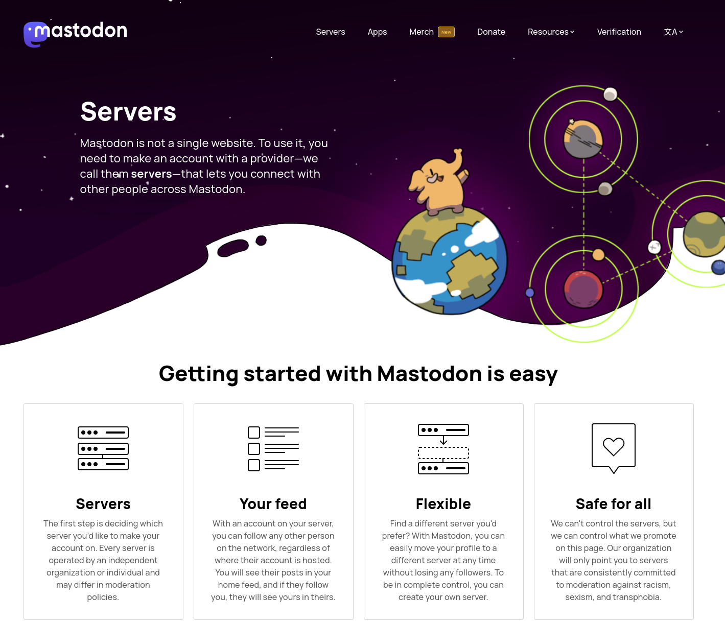
Let’s use for example Join Mastodon website.
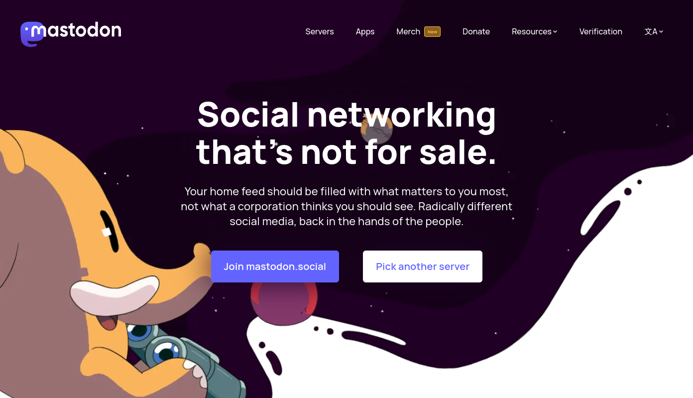
I note several issues for a basic user :
- The website is in English. As a French guy, my browser is set to use French by preference*, and the site is still in English.
- I have the choice to join mastodon.social, the biggest Mastodon instance, or “pick another server”. What does it mean ? dunno. Since the “Join mastodon.social” button is highlighted, a common user will click on it. And we lose the Fediverse most important interest, mastodon.social becoming a SPOF.
- The inscription form of mastodon.social is in English.
* Actually not, my browser is in English by default so it was only for the demonstration purpose.
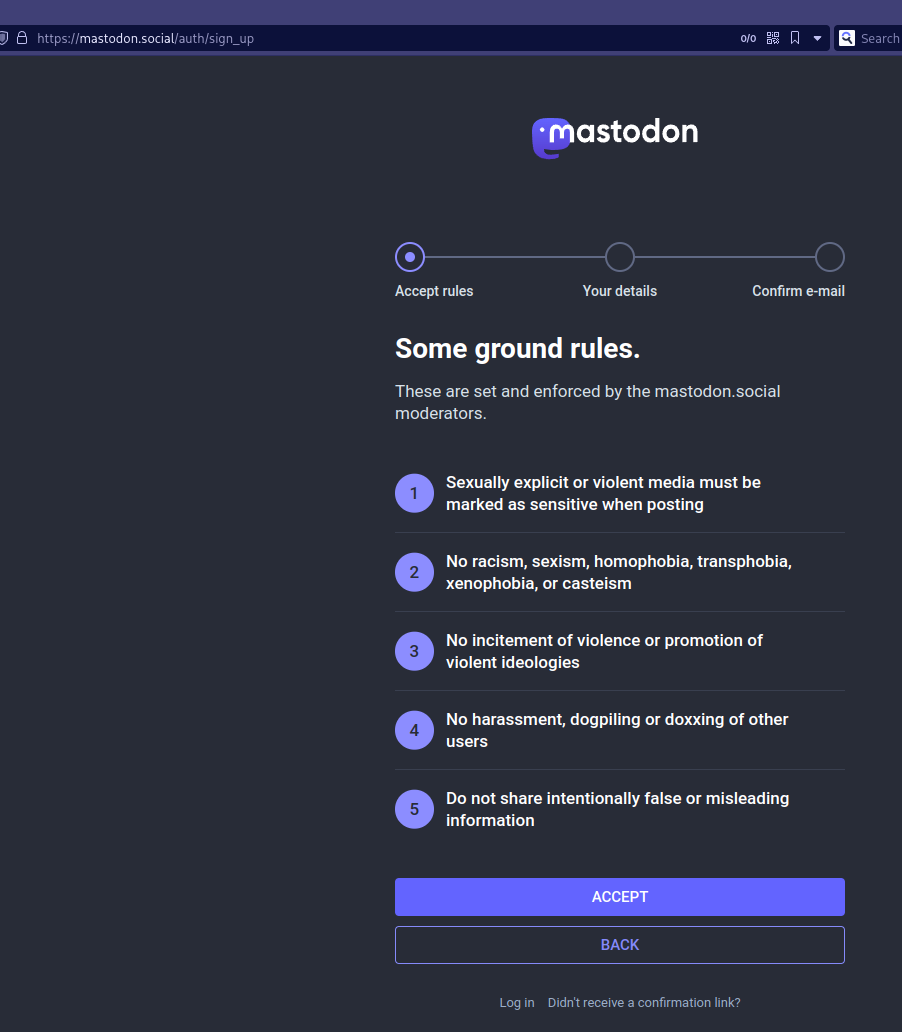
As the guy who is currently writing these lines in a language which it not his native tongue and using a lot English, I don’t care.
As a Frenchie basic user, I don’t feel like home and I think I will have to interact with people in English. It makes me feel uncomfortable.
In the case you think the language is not relevant, let’s remind that Fosstodon got stuck into a shitstorm drama last Summer until September because of it’s English-only rule until this rule got removed. Language definitely matter.
Maybe mastodon.social accepts various language, I genuinely don’t know. But if I put myself into a random user’s socks, I think I’ll have to use it in English because the interface is never in French.
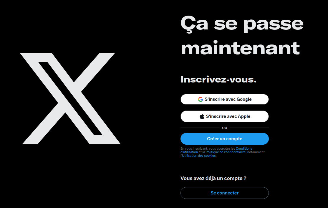
Compared to Twitter’s page, Join Mastodon seems complicated from the perspective of a user that is not aware if these details. And the website is in my native language.
Join PeerTube
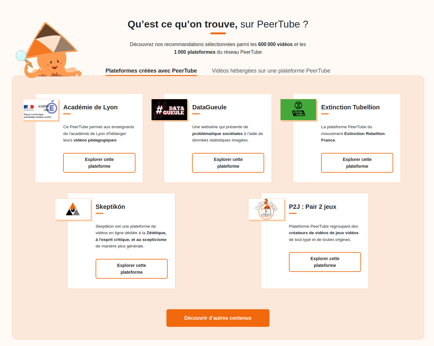
Unlike Join Mastodon, Join PeerTube is in French by default for me. Which is a good thing because it’s easy and understandable (and the software is French, BTW, so it would have been a shame).
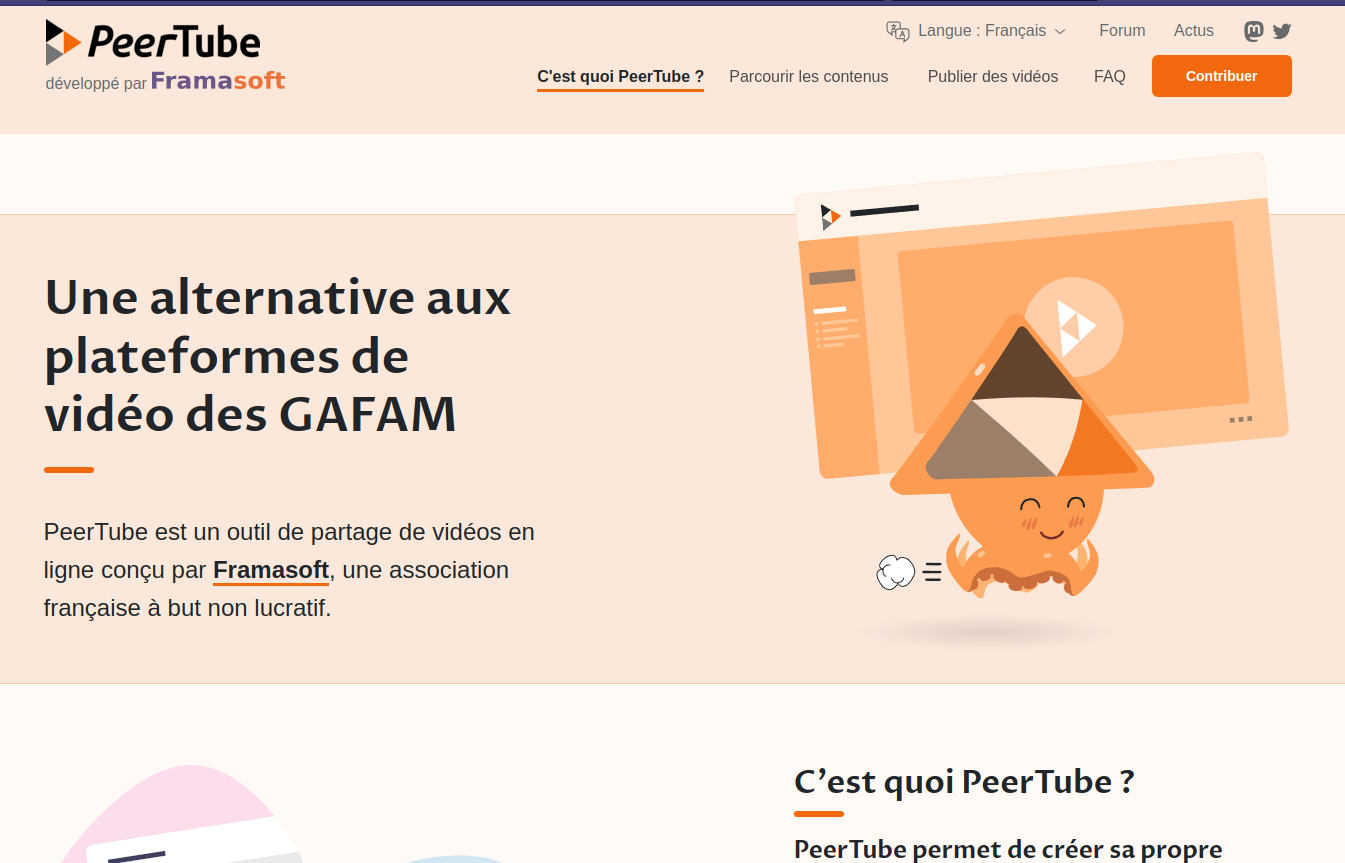
Buuuut, I’m still lost. OK, PeerTube is an alternative to the GAFAM video platforms, great, but how can I use it ? Dunno. Yes, there are instances mentioned just below, but think that people are sometimes too lazy to scroll. Yep. We’re in the everything-is-instant-as-a-service era. If the most important information does not jump to the viewer’s eyes, they’ll ignore it.
Join PixelFed
A last example with Pixelfed and I won’t go in details with it, the page has the sames issues as Join Mastodon. Except the fact that the user is invited to join a server, not the big instance. But the website is still in English by default.
![]()
And if I choose a French instance … The register form is still in English while I want my contents to be in French.
![]()
Join Fediverse websites
There are some “Join Fediverse” websites and people who maintain them are doing a great job. Unfortunately, they’ve fallen into the same trap. Maybe because most of the people who are fediverse enthusiasts are also tech-oriented people, so they possibly think about tools and not needs. It’s a bias I’ve addressed in a previous blog article and with the DevOps Solutions Map I’ve created this year (crap, I should really continue to work on this thing one day).
Let’s continue to search for it as a random French user.
The first result I’ve had was a nice blog article in French, very accessible and easy to understand. But as a random user, I want to join a social media, not reading what is it.
The second result is a dedicated wiki page explaining that I can join directly on Mastodon. But I end up in joinmastodon.org with the previously explained issues. The second link in the page propose a big list of instances in English.
Again, I’m lost.
Third result is a website called JoinFediverse, seems good ! And it’s in French !
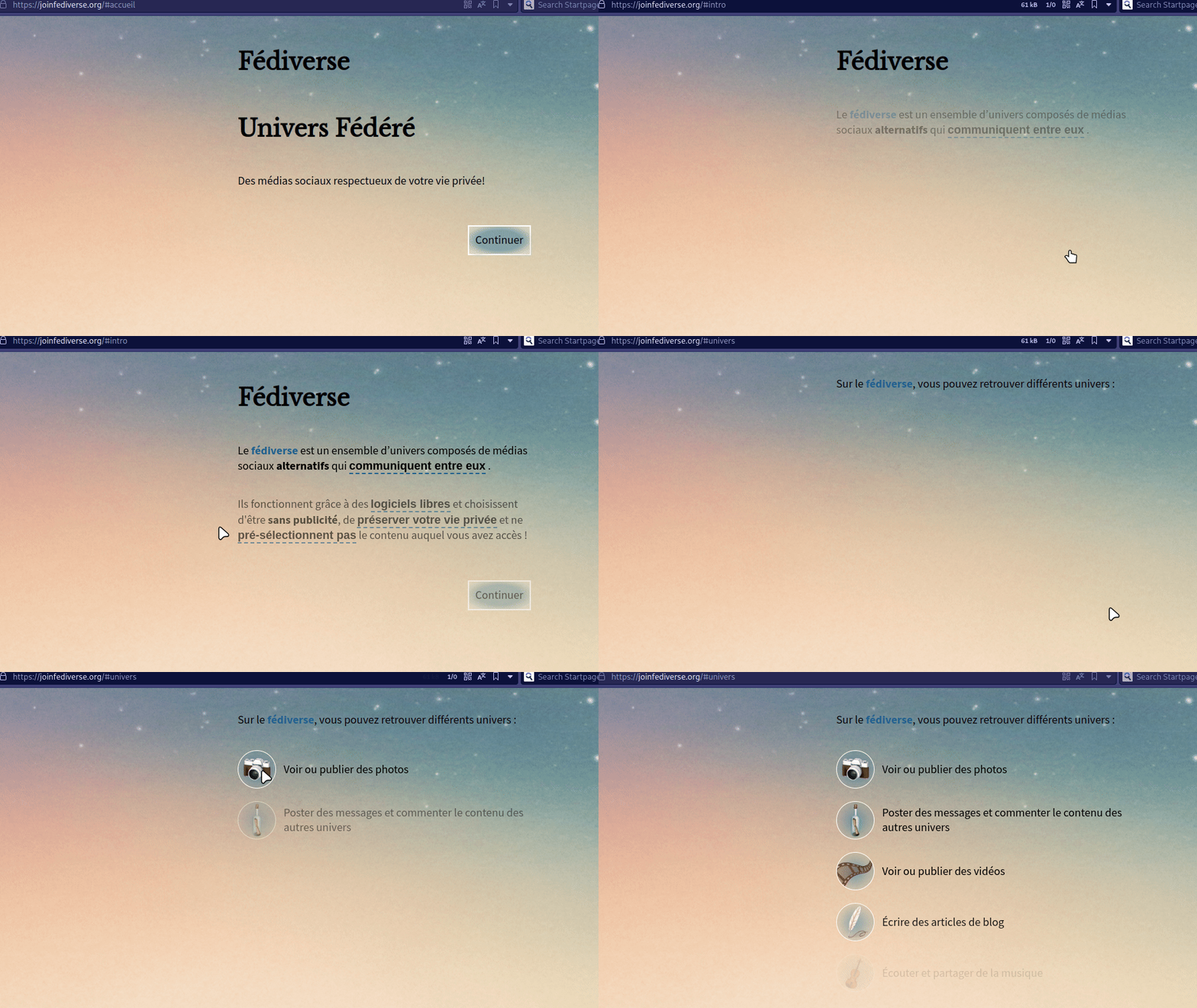
That’s beautiful, but I honestly don’t see the point of a slideshow that require to wait for the content to display for a “join something” site.
I’ve switched to English search to find other websites.
Join The Fediverse is pretty nice actually. It’s answering in French and uses the e-mail metaphor to explain the Fediverse : very good !
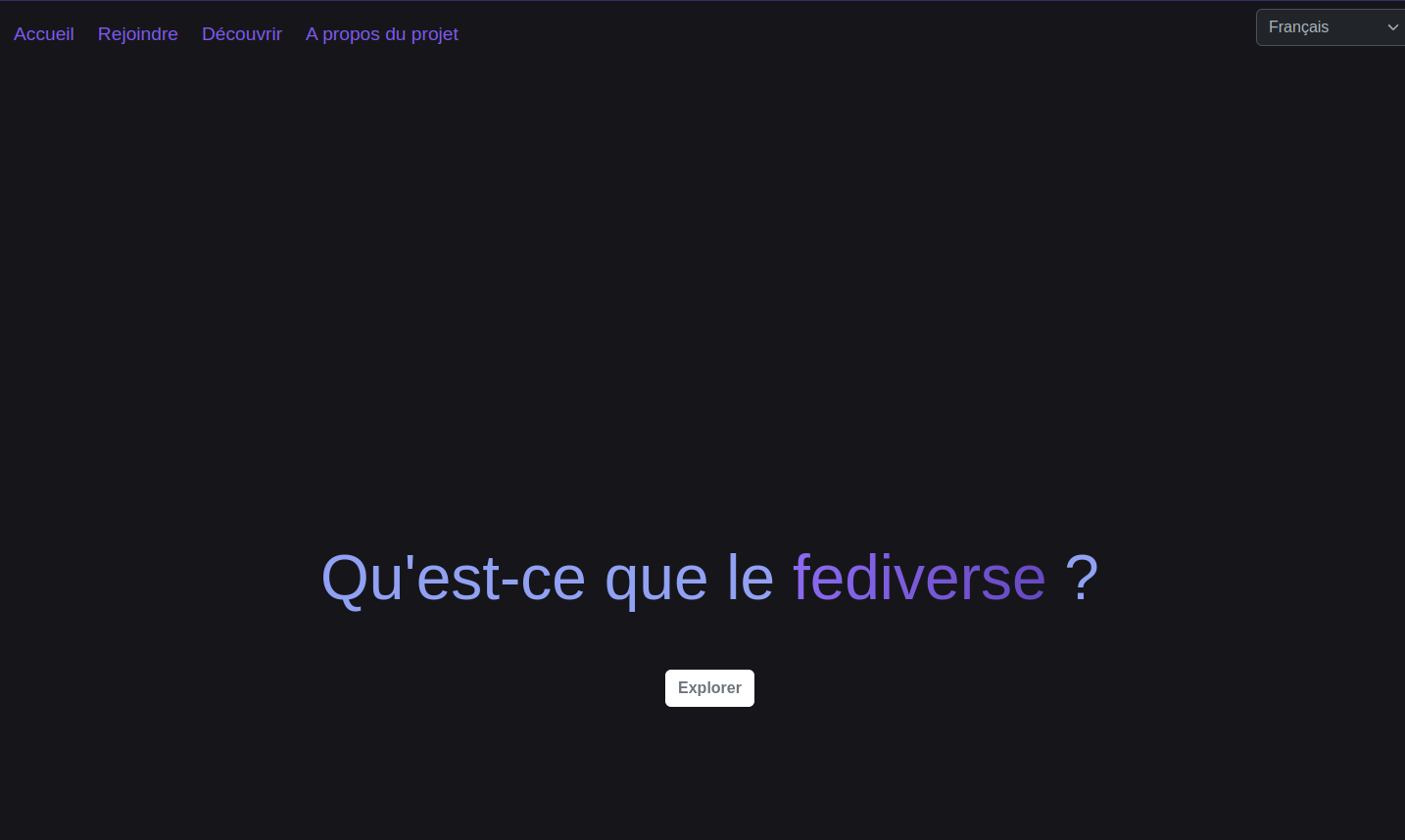
If I click on “Rejoindre” (Join), the page displays the centralized platform with their counterparts.
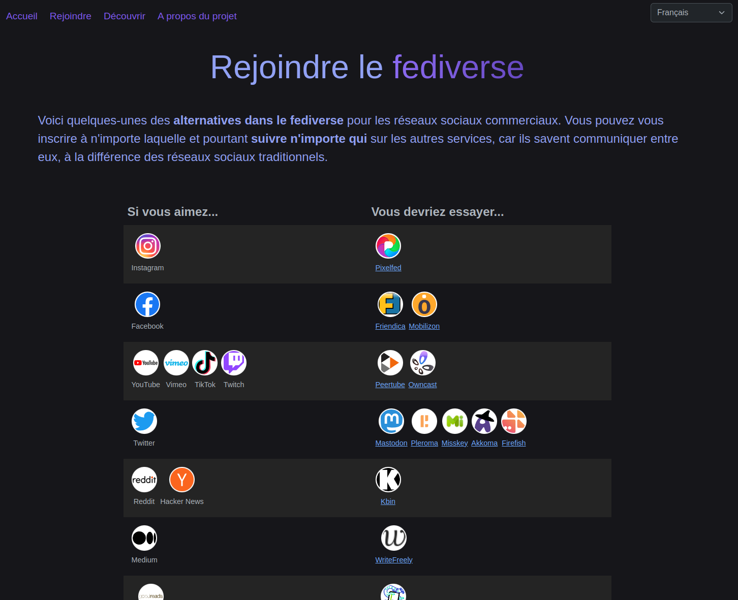
So far, it’s one of the best portal about the Fediverse I’ve seen. Problem : the link about the tools are redirecting to the Join The Fediverse Wiki. And there are in English.
Unfortunately, I’ve never been able to fall on the Fediverse Directory managed by @fedifollows. This site is a goldmine of humanly curated profiles to discover, also with a lot of tips and good informations. But it’s still in English.
Some possible enhancement to ‘join fediverse’ initiatives
I think I’ve made my point, so now let’s propose something.
The home page
First, I think a good Join the Fediverse portal should jump right into the topic : propose something. Compare JoinMastodon and Twitter’s homepage : Twitter does not explain what is Twitter, same as Facebook or Instagram. Of course I know why Mastodon and other tools explain what they are et with they exist, but I think most of the users don’t really care. They just want to use something.
So I would put in my functional specification that the portal should briefly present what is the Fediverse to the user and immediately propose to jump into it. Maybe two big buttons like Joinmastodon :
- Join the Fediverse
- What is the Fediverse
The second most important thing that I’ll note in the functional spec : the website must be in the user’s default language.
Since we all like big numbers, some Fediverse statistics may be cool to display.
Also, don’t drown the user in the tools’ diversity. Not yet. The Fediverse should be seen as a whole consistent network just like Twitter or TikTok are.
What is the Fediverse page
The explanation made by Join The Fediverse is awesome, nothing to change !
Join the Fediverse page
This is where things can get difficult because of the Fediverse’s diversity.
I would propose two approaches for the user :
- A social media oriented approach : same as Join the Fediverse, showing the centralized social medias et and their Fediverse counterparts.
- And if the person doesn’t really know, proposing use cases :
- I want to communicate with people
- I want to follow people
- I want to share photos
- I want to watch videos
- etc
Then, redirecting them to the related social media.
The social media list page
Join Mastodon and Join PixelFed has the basis for a good way to reach people, but there’s room for improvement.
You see, on Join Mastodon, the first thing they think about is the servers. As a user, I don’t care.
PixelFed goes right into the topic, I think it’s a better way.
![]()
So I’ll put in the functional spec the following parts :
- The user should have three easy to use choices :
- The instance’s region and main language, should be prefilled by the browser’s language setting
- The instance’s topic
- The instance use case (blogging, photo sharing, video, etc)
The user should not have to choose for Mastodon, PixelFed, PeerTube, etc, yet but the instances results may already propose the most relevant choices.
The instance details page
Actually, I really like PixelFed’s way. Join Mastodon is too basic : select an area, an instance, then go register on it.
PixelFed’s propose a very detailed instance page with a normalized layout.
![]()
Honestly, I love it because one of the main criticism I’ve seen about Mastodon is the “my home, my rules” aspect of the platform. Here, you have a preview of what’s in the store : the instance’s statistics in a very understandable way, a preview of some contents, the services proposed, the activity and the admin’s profile, and the rules.
So let’s put in the functional spec this :
- Each social media instance should have a detailed page about :
- Their identity card (name, description, country, number of people, number of connected instances, who is the admin, etc)
- A preview of the content
- The rules list
- The possible limitations
And I think we have a good start.
A summary
I wanted to try to make a mockup to expose the idea, but I couldn’t find a way to do something nice. So I’ll just try to summarize the idea.
First, the “join” portal must absolutely be contextualized with the user’s language.
Second, don’t try to explain why you are different, what you are, etc, directly at the beginning. If we look at the centralized social media, they’re immediate because that’s what the people are used to. TikTok has an homepage full of content such as YouTube, while Twitter, Facebook or Instagram are “sign-up” walled. The second case is bad to me, so the “content page” is a better approach.
The portal must ensure the user won’t be lost in the Fediverse’s diversity. I think we should focus on the expectation instead of the service. People know what is Twitter or TikTok because they’re brand and services. Mastodon or PixelFed are tools, the brands and services are the instances. That’s the confusing part of the story to me. Like I said earlier, the Fediverse should be seen as a consistent network, the tools behind it being abstracted.
The possible abstraction requirement could be such as reducing the tools names visibility and focusing on the Fediverse content. Displaying the content by showing it with a little reference to where is it hosted may be a good way to explain what it the Fediverse. With some invitation to join such as “Create an account on whichever Fediverse instance you want, and you’ll be able to interact with all of these people no matter where you are”.
The most important thing the back end should have IMHO is a good referencing system of the instances. If we want to answer to needs (I want to share pictures, I want to share my thoughts, I want to talk with people, etc), the referencing should ensure the various criteria allow the user to find the most adapted Fediverse tool and instance. Basically, the first result should propose instances using the user’s language as their main one. Then, filter by topic (General, Tech, Art, Society…). The instance type (Mastodon, Pixelfed, Lemmy, etc) should be deducted from the use cases.
Think about a MMORPG with there various regions and servers. The players are usually redirected to closest (EU, USA, Asia…) and the less loaded ones available for a better experience. It could be an inspiration such as : I’m in France, my Fediverse instance should be here too for a better experience.
Instances that are on invitation only or not opened to registration should have the lowest priority because joining them would be more complicated.
The proposed instance, whichever the tool, should have a normalized identity card displaying various important informations such as the instance type, it’s suited use case, statistics and rules. IMHO, PixelFed did an awesome job on this part and should be an inspiration.
And with that, I think people who are less into the Fediverse background should be more confident to join it instead of being drowned by tools and English servers.
I hope this article could inspire some initiatives.